Lesson Questrade Edge Mobile

Charting

Learn more about the 10 different chart types, 49 different studies and more advanced charting features available in Edge Mobile.

Edge Mobile’s advanced charting features give you the power to analyze candlestick charts on the go to help you make the most informed trading decisions.

Prefer using technical analysis? Edge Mobile has you covered with extensive time durations for your charts, volume information, studies, comparison tools and much more.

When viewing a security’s quote in full screen, you’ll see a smaller line chart displaying the recent price movements.

Mini chart quotes

To quickly reference a data point anywhere on the mini-chart, simply hold and drag your finger to the selected date or time range.

Edit the time range you’re viewing on the mini chart using the 1D, 5D & etc buttons, or tap the full screen button on the bottom right to view a more detailed candlestick chart.

Want a quick overview of candlesticks and how they work?

Check this infographic out for more information.

Full screen candlestick (and other) charting

When you tap the Full screen button at the bottom right side of the mini chart, you’ll see a rich detailed candlestick chart. If you prefer a different chart type, you’ll be able to select from a list in the top navigation menu. We’ll cover different chart types lower down.

Rotate your display at any time during full screen charting to see a landscape view of your custom chart studies and much more.

You can search for another ticker symbol using the magnifying glass icon at the top right at any time.

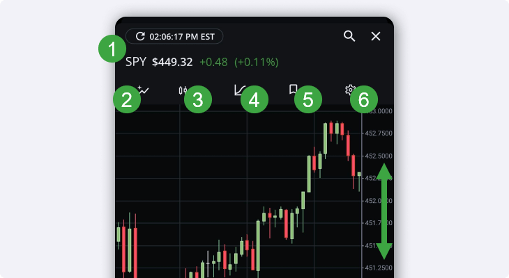
  1. Tap the Snap Quote button above the symbol to refresh the charts and figures on this page.
    • The ticker symbol, last traded price and change in price since market open will be visible here at the top.
  2. Tap the Comparison tool to add another stock or ETF to compare the performance between multiple ticker symbols.
  3. The Chart type menu allows you to switch between the default candlestick chart, and nine other popular chart types.
    • More information on this lower down
  4. The Studies menu lets you choose from more than 49 different technical studies and fully customizable indicators that you’re able to add to your chart.
    • We’ll cover studies in more detail lower down as well
candlestick chart navigation studies

5.  The Layouts menu allows you to save this current layout (studies, chart type, range & etc) or select from your previously saved layouts.

  • This can be super helpful to switch between your favourite layouts that use different studies and time ranges or frequencies.

6.  Lastly, the Settings menu allows you to toggle a mini Range Selector for the bottom of your chart, enable extended hours charting or modify your Y axis preferences.

  • Tip: If you’re shorting, the “Invert” feature can be super helpful to flip your chart’s axis.

Swipe up or down on the dollar values on the right to view more prices and zoom your view in and out.

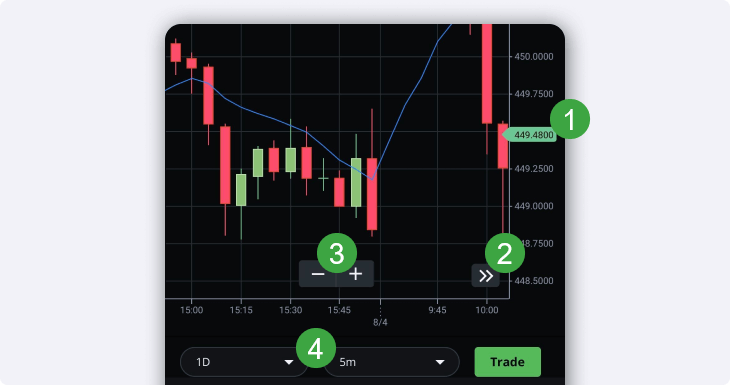
Swipe left or right at the bottom of your chart to view different time ranges and/or dates.

  1. The last traded price is visible in the green or red callout box.
    • The colour depends on the last “tick” up or down (change in price from one trade to the next)
  2. Tap the arrow button to return to the most recent view for your time range.
candlestick chart bottom studies

3.  Zoom in or out of the time range you’ve selected.

  • Tip: You can also pinch to zoom in or out on the chart to display different time ranges.

4.  Change your time range and frequency.

  • We’ll cover this in more detail below.

You can also tap the green Trade button at the bottom right of the full screen chart to bring up the order entry screen for this security.

On the full screen chart in either portrait or landscape view, you can also hold and drag your finger to different candlesticks to bring up the Volume, Open, Close, Low, and High for that specific candle.

This can be incredibly helpful to analyze a specific time range where there’s been unusual volume, or unexpected volatility.

candlestick chart individual candle view

Range and frequency

To change your display from viewing the 1 Day range and 1 minute candlesticks, tap the menu buttons at the bottom to expand the different time ranges and frequencies.

candlestick chart range selector

Depending on the date range you select, different time frequencies will be available for the candlesticks.

For example, with the 1 day range, you can choose from:

  • 1 minute
  • 5 minutes
  • 10 minutes
  • 15 minutes
  • 30 minutes

While the YTD, or 5yr range will give you candlesticks that are 1 day, 1 week, or 1 month in frequency.

Learn more about candlestick charting in this infographic.

In landscape view, it’s easier and quicker to adjust your date ranges and time frequency using the buttons right below the chart.

The comparison tool

The comparison tool button at the top left hand side of your candlestick charts allows you to compare the performance of the security you’re viewing against any other security or index.

When you tap this button, the symbol search window will appear. Search for another company, ETF or Index using the ticker symbol or name.

After adding a comparison to your chart, the X-axis (vertical) on the right hand side will change from an absolute dollar value to a relative percentage value that compares the performance of the securities you’ve selected.

chart comparison tool

Feel free to add many different ticker symbols to your chart to compare the performance of multiple securities at the same time.

You can also customize the different Plots on your chart by toggling them on or off, modifying the colours, or removing them with the “x” button.

Customize your Plots

Whether you’re using the comparison tool from above, or the chart studies explained below, you’re able to customize the plots on your chart by tapping the small coloured square.

Choose from a wide variety of colours to set your chart up exactly how you want. This can be very useful if you’re using a lot of different plotting tools to help you see the data you need more easily.

custom plot colours charts

Chart types available in full screen

Edge Mobile unlocks even more customization options with 10 different chart types to choose from.

Interested in switching from the default candlestick view? Tap the chart type button near the top left above your chart.

chart type selector

Choose from the following different chart types:

  • Candlestick
  • Colored Bar
  • Line
  • Step
  • Mountain
  • Baseline
  • Hollow Candle
  • Scatterplot
  • Histogram
  • Heikin Ashi

Custom chart studies

Interested in more technical analysis for the securities you’re charting? Edge Mobile unlocks more than 49 different custom chart studies that you’re able to modify and even save to your layouts and use in the future.

Tap the Studies icon in the middle right above your full screen candlestick chart to bring up the scrollable studies menu.

chart studies menu
  1. Tap this button to quickly clear all the studies currently on your chart
  2. Tap any of the information icons next to the studies to learn more about how they work, and how you can customize the different components of the study.
chart studies information widget

Modifying chart studies

After adding a chart study (or more than one study at a time), you’re easily able to customize and modify your view to see the exact information you’re looking for.

Modify plots on chart studies
  1. Expand or shrink the specific plot menu. This brings up a shortcut to change your study’s colour and custom values.
  2. Use the small arrow buttons to reorder your studies, or to move them from the bottom to the top of your chart.
    • Certain studies can also be expanded at the top or the bottom of your chart using the small square button next to the arrow symbols.
  3. Show or hide a study quickly with the toggle. If you want to remove it from your chart, use the “x” button.
modify chart studies main

To customize a study, you can either tap on the name in the Plots menu, or tap on the specific study that is overlaid on your chart.

customize chart studies from chart

This allows you to modify the different values and attributes of that specific study, giving you even more customization options for the technical analysis you’d like to do.

When you tap the name of the study, or the pencil icon after selecting the study from your chart, this will bring up a sub-menu to modify your study.

custom chart study menu

Finished modifying the values, colours or attributes of your selected study? Make sure to tap the green Save button at the bottom before returning to your chart.

Saving custom layouts

After spending time setting up the perfect custom studies and indicators, don’t forget to save your new favourite layout using the menu near the top right hand side of the chart.

This will save all your existing studies, plots, comparisons, custom values and more so you can use them for a different ticker symbol, or at any point in the future.

Saved layouts custom charts

Want to remove a layout? Tap the trashcan icon right next to it to quickly delete it from your saved layouts.

Chart settings

Looking for even more chart settings and customization options? Tap the gear icon at the top right hand corner of your full screen chart to bring up a menu with a few additional options to choose from.

fullscreen chart settings menu

Range Selector toggles an interactive widget at the bottom of your chart that allows you to quickly jump between different time ranges. Drag the selected range left or right to “scrub” forwards and backwards through the chart using your selected range durations.

You can also tap and drag the left or right hand side of the range to expand or shrink the time range you’re looking at.

range selector fullscreen chart

Extended Hours turns the extended hours view on or off. When this option is enabled, premarket hours are shown with a dark blue background, and after-hours trading is shown with a dark brown background.

extended hours charting

Log scale toggles the price scale of your chart between logarithmic and linear.

  • Log scales will depend on the relative percentage of change in the underlying asset’s price.
  • Linear scales show absolute price values with equal spacing between prices.

Invert flips the X axis of your chart horizontally, and displays price action “upside down”. This can be incredibly useful if you’re shorting securities and will flip your chart for easier analysis.

Note: The information in this blog is for educational purposes only and should not be used or construed as financial or investment advice by any individual. Information obtained from third parties is believed to be reliable, but no representations or warranty, expressed or implied, is made by Questrade, Inc., its affiliates or any other person to its accuracy.

Related lessons

Want to dive deeper?

Read next

Explore

Have more questions?

Tell us what you need help with, and we’ll get you in touch with the right specialist.